
Interactive data visualization in Python using Bokeh
A basic to advanced guide to making interactive plots in Bokeh.
Bokeh is a Python library for creating interactive visualizations for modern web browsers. It helps you build beautiful graphics, ranging from simple plots to complex dashboards with streaming datasets. Bokeh empowers you to create JavaScript-powered visualizations without writing any JavaScript yourself.
Bokeh has a great documentation, including a executable notebook. I strongly recommend you to get started with that.
Download Codes
You can download all the codes from my github repository.
Installation:
The codes contain environment.yml file that contains all the details of the used Python packages. Install all the libraries using conda in a separate environment:
conda env create -f environment.yml
Similar posts
Topics Covered (for details see my Jupyter Notebook):
-
Setting the dimension of the figure and plotting markers
import numpy as np from bokeh.plotting import figure from bokeh.io import output_file, save, show x = [1,2,3,4,5] y = [6,7,8,9,10] p = figure(plot_width=300, plot_height=300) circ=p.circle(x,y) show(p) -
Styling the markers and the figure background
# output_file("bokeh_tutorial.html") x = np.random.rand(10)*10 y = np.random.rand(10)*10 p = figure(plot_width=300, plot_height=300) p.circle(x,y,radius=0.1,fill_color='red',fill_alpha=0.7,line_dash="dashed",legend='circle') p.triangle(np.random.rand(10)*10,np.random.rand(10)*10,legend='triangle') p.line(np.random.rand(10)*10,np.random.rand(10)*10,line_color='black',legend='line') p.background_fill_color='lightgray' show(p) -
Setting and styling the title of the figure
p.title.text = "Random Scatter" p.title.text_color = "black" p.title.text_font = "times" p.title.text_font_size = "25px" p.title.align = "center" show(p) -
Styling the axes of the figure
from bokeh.models import Range1d p.axis.minor_tick_line_color = "blue" p.xaxis.minor_tick_line_color = "red" # p.xaxis.minor_tick_line_color = None # p.yaxis.minor_tick_line_color = None p.yaxis.major_label_orientation = "vertical" p.xaxis.visible = True p.xaxis.axis_label = "X-axis" p.yaxis.axis_label = "Y-axis" p.axis.axis_label_text_color = "blue" p.axis.major_label_text_color = "orange" # Axes Geometry # p.x_range = Range1d(start=0,end=15) p.x_range = Range1d(start=0,end=10,bounds=(-10,20)) p.y_range = Range1d(start=0,end=10) p.xaxis[0].ticker.desired_num_ticks=2 p.yaxis[0].ticker.desired_num_ticks=10 show(p) - Styling the grid and legends
p.xgrid.grid_line_color = "gray" p.xgrid.grid_line_alpha = 0.3 p.ygrid.grid_line_color = "gray" p.ygrid.grid_line_alpha = 0.3 p.grid.grid_line_dash = [5,3] # p.legend.location = (1,1) p.legend.location = 'top_left' p.legend.background_fill_alpha = 0.6 p.legend.border_line_color = None p.legend.margin = 10 p.legend.padding = 18 p.legend.label_text_color = 'olive' p.legend.label_text_font = 'times' show(p) -
Introduction to ColumnDataSource
from bokeh.sampledata.iris import flowers from bokeh.models import ColumnDataSource colormap={'setosa':'red','versicolor':'green','virginica':'blue'} flowers['color'] = [colormap[x] for x in flowers['species']] flowers['size'] = flowers['sepal_width'] * 5 setosa = ColumnDataSource(flowers[flowers["species"]=="setosa"]) versicolor = ColumnDataSource(flowers[flowers["species"]=="versicolor"]) virginica = ColumnDataSource(flowers[flowers["species"]=="virginica"]) p = figure(height=500,width=500) p.circle(x="petal_length", y="petal_width", size='size', fill_alpha=0.2, color="color", legend='Setosa', source=setosa) p.circle(x="petal_length", y="petal_width", size='size', fill_alpha=0.2, color="color", legend='Versicolor', source=versicolor) p.circle(x="petal_length", y="petal_width", size='size', fill_alpha=0.2, color="color", legend='Virginica', source=virginica) p.legend.location = 'top_left' p.xaxis.axis_label = "Petal Length" p.yaxis.axis_label = "Petal Width" p.title.text = "Petal plot" p.legend.click_policy='hide' show(p) - Configuring toolbars for the plot
from bokeh.models import PanTool, ResetTool, HoverTool, WheelZoomTool, BoxZoomTool, HoverTool, SaveTool p.tools = [PanTool(),ResetTool(), WheelZoomTool(), BoxZoomTool(), SaveTool()] hover = HoverTool(tooltips=[("Species","@species"), ("Sepal Width","@sepal_width")]) p.add_tools(hover) p.toolbar_location = 'above' p.toolbar.logo = None show(p) -
Bokeh layouts - column, row, gridplot
p2 = figure(height=500,width=500)
p2.circle(x="sepal_length", y="sepal_width", size='size', fill_alpha=0.2,
color="color", legend='Setosa', source=setosa)

p2.circle(x="sepal_length", y="sepal_width", size='size', fill_alpha=0.2,
color="color", legend='Versicolor', source=versicolor)

p2.circle(x="sepal_length", y="sepal_width", size='size', fill_alpha=0.2,
color="color", legend='Virginica', source=virginica)
p2.legend.location = 'top_left'
p2.xaxis.axis_label = "Sepal Length"
p2.yaxis.axis_label = "Sepal Width"
p2.tools = [PanTool(),ResetTool(), WheelZoomTool(), BoxZoomTool(), SaveTool()]
hover2 = HoverTool(tooltips=[("Species","@species"), ("Sepal Width","@petal_width")])
p2.add_tools(hover2)
p2.toolbar_location = 'above'
p2.toolbar.logo = None
p2.title.text = "Sepal plot"
p2.legend.click_policy='hide'
show(p2)
from bokeh.layouts import column show(column(p, p2))from bokeh.layouts import row show(row(p, p2))from bokeh.layouts import gridplot layout1 = gridplot([[p, p2]], toolbar_location='right') show(layout1) -
Bokeh widgets - Tabs, Panel
from bokeh.models.widgets import Tabs, Panel # Create two panels panel1 = Panel(child=p, title='Petal') panel2 = Panel(child=p2, title='Sepal') # Assign the panels to Tabs tabs = Tabs(tabs=[panel1, panel2]) # Show the tabbed layout show(tabs) -
Selecting data points in the bokeh figure
select_tools = ['box_select', 'lasso_select', 'poly_select', 'tap', 'reset'] p = figure(height=500,width=500,x_axis_label='Petal Length',y_axis_label="Petal Width" ,title="Petal Plot",toolbar_location='above',tools=select_tools) p.circle(x="petal_length", y="petal_width", size='size', fill_alpha=0.2, color="color", legend='Setosa', source=setosa,selection_color='deepskyblue', nonselection_color='lightgray', nonselection_alpha=0.3) p.circle(x="petal_length", y="petal_width", size='size', fill_alpha=0.2, color="color", legend='Versicolor', source=versicolor,selection_color='deepskyblue', nonselection_color='lightgray', nonselection_alpha=0.3) p.circle(x="petal_length", y="petal_width", size='size', fill_alpha=0.2, color="color", legend='Virginica', source=virginica,selection_color='deepskyblue', nonselection_color='lightgray', nonselection_alpha=0.3) p.legend.location = 'top_left' p.legend.click_policy='hide' p.toolbar.logo = None show(p) -
Linking Plots
plot_options = dict(width=250, plot_height=250, tools='pan,wheel_zoom,reset')
x = list(range(11))
y0, y1, y2 = x, [10-i for i in x], [abs(i-5) for i in x]

# create a new plot
s1 = figure(**plot_options,title='s1: linked x and y with s2')
s1.circle(x, y0, size=10, color="navy")

# create a new plot and share both ranges
s2 = figure(x_range=s1.x_range, y_range=s1.y_range, **plot_options,title='s2: linked x and y with s1')
s2.triangle(x, y1, size=10, color="firebrick")

# create a new plot and share only one range
s3 = figure(x_range=s1.x_range, **plot_options,title='s3: linked x with s1 and s2')
s3.square(x, y2, size=10, color="olive")

p = gridplot([[s1, s2, s3]])

# show the results
show(p)
Real World Examples
Other than the basic introduction, this tutorial includes two examples:
- Plot of the Earthquake events (the event information are obtained using the FDSN service from Obspy package)
python EQviz.py for the plot without widgets
–> See here for the end result.
bokeh serve EQviz_with_widgets.py for plot with the input box for the starting and end year for the search of events. This is quite slow as the program need to request data using the Obspy method each time.
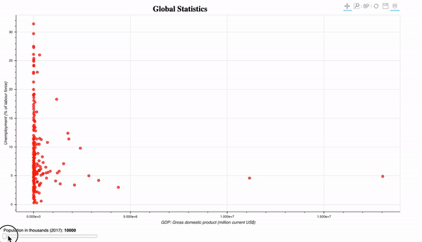
- Interactive plot of the global population statistics. Introduction of the slider widget. The widgets can be similarly implemented. To execute this program, you need to run it on the bokeh server using the command:
bokeh serve plot_global_stats.py
- Streaming random data: randomly plot 10 circles glyphs.
bokeh serve streaming_data.py
Disclaimer of liability
The information provided by the Earth Inversion is made available for educational purposes only.
Whilst we endeavor to keep the information up-to-date and correct. Earth Inversion makes no representations or warranties of any kind, express or implied about the completeness, accuracy, reliability, suitability or availability with respect to the website or the information, products, services or related graphics content on the website for any purpose.
UNDER NO CIRCUMSTANCE SHALL WE HAVE ANY LIABILITY TO YOU FOR ANY LOSS OR DAMAGE OF ANY KIND INCURRED AS A RESULT OF THE USE OF THE SITE OR RELIANCE ON ANY INFORMATION PROVIDED ON THE SITE. ANY RELIANCE YOU PLACED ON SUCH MATERIAL IS THEREFORE STRICTLY AT YOUR OWN RISK.
Leave a comment