
How to deal with irregularly sampled time series data
While analyzing time series data, we often come across data that is non-uniformly sampled, i.e., they have non-equidistant time-steps. Infact, most of the recordings in nature are non-uniformly sampled. It is well known that the analysis of irregularly spaced data sets is more complicated than that of regularly spaced ones. How can we deal with such datasets? Can we always interpolate such time series to make it uniformly sampled?
While analyzing time series data, we often come across data that is non-uniformly sampled, i.e., they have non-equidistant time-steps. Infact, most of the recordings in nature are non-uniformly sampled. It is well known that the analysis of irregularly spaced data sets is more complicated than that of regularly spaced ones. How can we deal with such datasets? Can we always interpolate such time series to make it uniformly sampled?
In this post, we will see some effective methods to deal with irregularly sampled datasets.
Can we always interpolate irregularly sampled data?
When we come across irregularly sampled data, the first thing we tend to do is to interpolate or resample them. This makes our life much easier as we can directly apply standard methods of analyses. However, when we interpolate the time series data, we assume (sometimes unknowingly) that data samples behave monotonically at each interval. This assumption may not hold if we over interpolate the data, interpolate the data with large variations in data intervals or timesteps, and so on. If this assumption doesn’t hold then it may lead to many artifacts or misleading results.
Distribution of timesteps
One of the most important factor to consider while dealing with time series data is the distribution of their timesteps. Structure present in the data is often more clearly displayed by a continuous curve than by the scattered, clumped original data points. The best way to visualize the distribution is to plot the histogram of time intervals of the datasets.
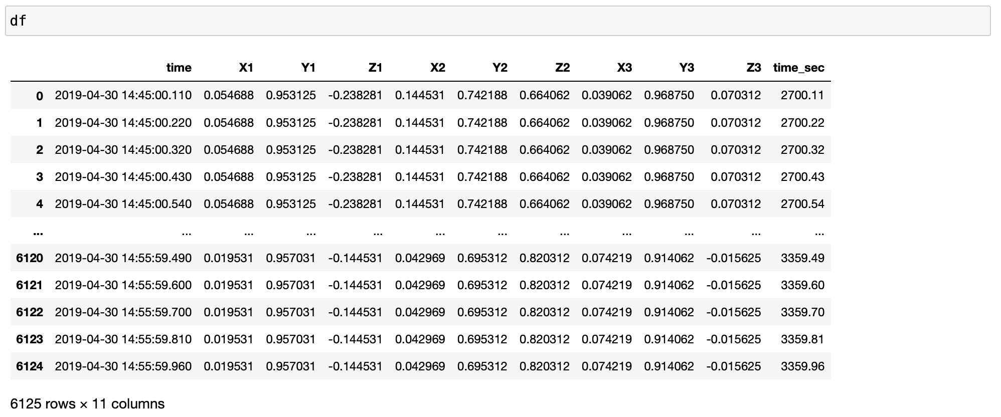
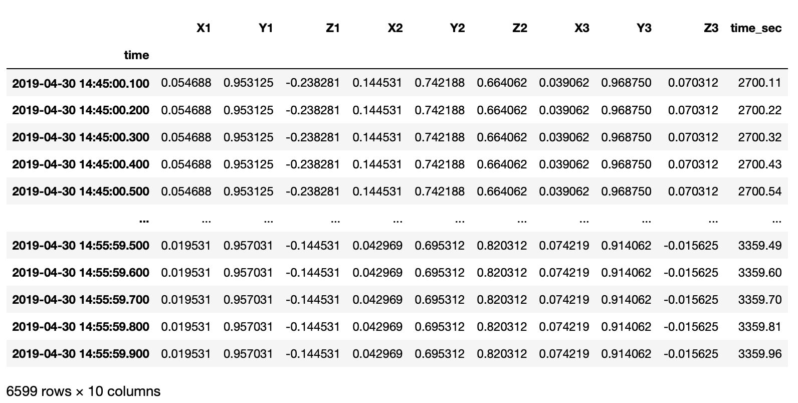
I have an irregularly sampled real-world time series data in file in xlsx format.
import pandas as pd
import numpy as np
import matplotlib.pyplot as plt
import seaborn as sns

plt.style.use('seaborn')

plt.rc('font', size=20) #controls default text size
plt.rc('axes', titlesize=20) #fontsize of the title
plt.rc('axes', labelsize=20) #fontsize of the x and y labels
plt.rc('xtick', labelsize=20) #fontsize of the x tick labels
plt.rc('ytick', labelsize=20) #fontsize of the y tick labels
plt.rc('legend', fontsize=20) #fontsize of the legend

# pip install openpyxl xlrd

df = pd.read_excel(xlsfilename, sheet_name=sheetname)

timearray = pd.to_datetime(df['time'], format="%Y_%m_%d_%H_%M_%S_%f")
df['time'] = timearray
df['time'] = df['time'].sort_values(ascending=True)
df['time_sec'] = df['time'].dt.minute * 60 + df['time'].dt.second + df['time'].dt.microsecond / 10e5
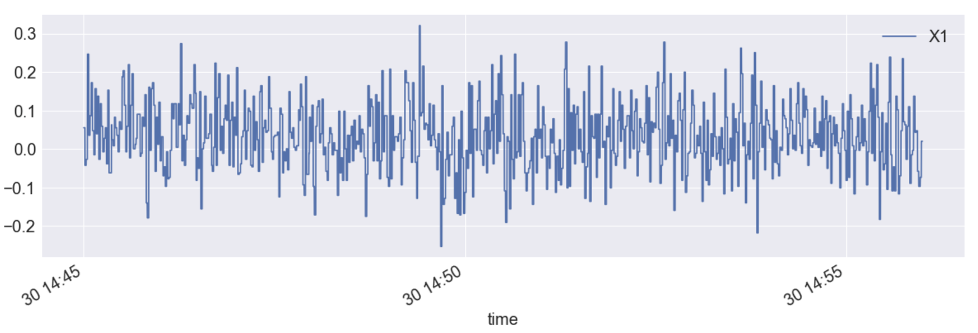
df.plot(x="time",y="X1", figsize=(20,6))
dt = pd.Series(df['time_sec'].diff(), name='dt in seconds')
dt.value_counts()
0.10    2264
0.11    1835
0.11     705
0.10     548
0.12     338
0.13     130
0.12     108
0.14      46
0.13      42
0.15      40
0.14      20
0.16      11
0.17       9
0.16       7
0.09       5
0.09       5
0.15       4
0.18       2
0.19       2
1.10       1
0.20       1
0.18       1
Name: dt in seconds, dtype: int64
sns.set(rc={'figure.figsize':(12,6)})
ax = sns.distplot(dt, kde=False)
ax.set(yscale="log")
ax.set(ylabel="Number of observations")
plt.savefig('df_distplot.png', dpi=300, bbox_inches='tight')
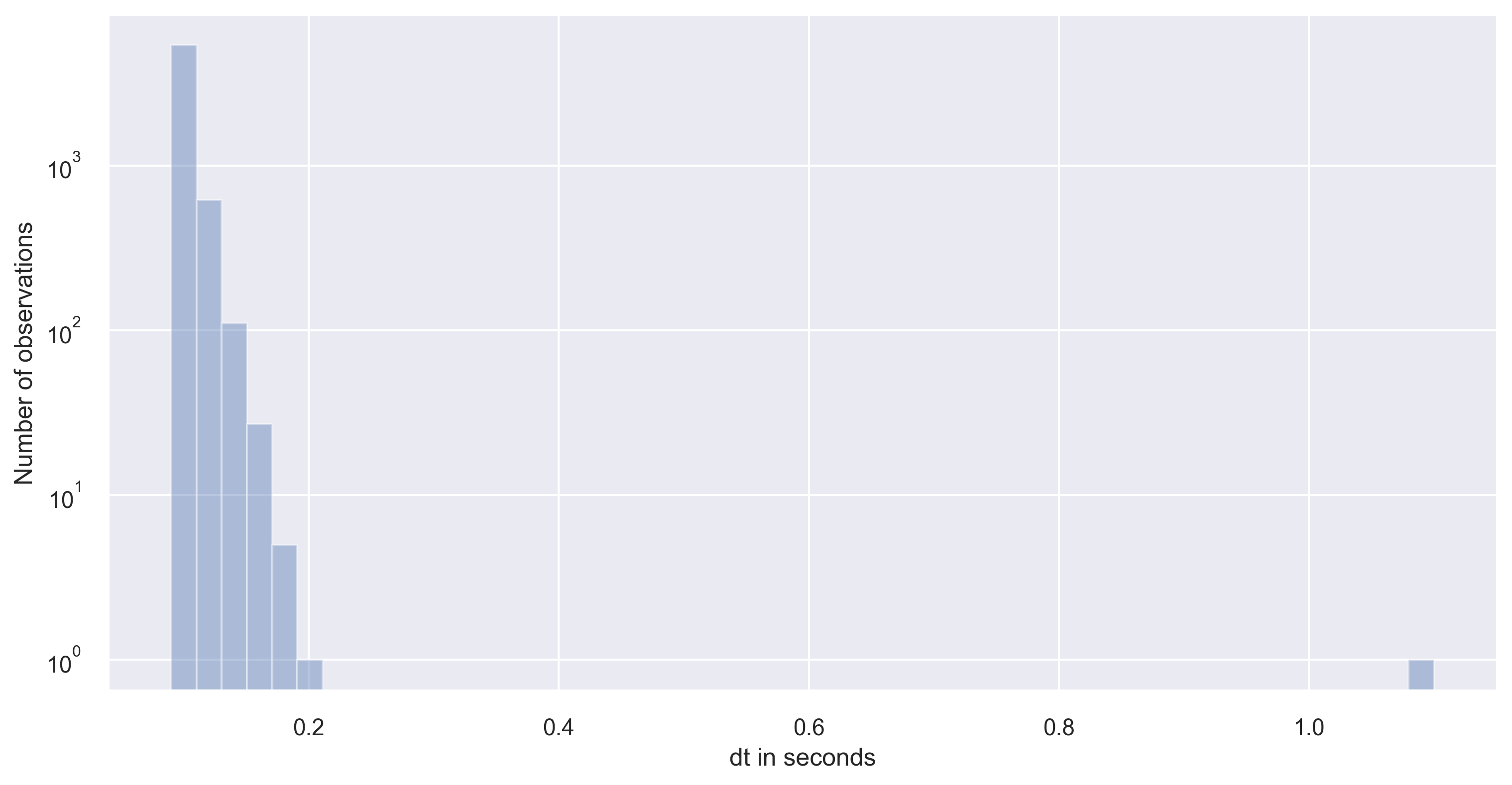
As you can notice that the timestep has large variance in our dataset. Please note that large or small variance of the data is subject to the problem in consideration. If the variance is small enough to neglect then, we can simply interpolate the datasets.
However, if there is a large variance of the timesteps in the time series data, then we need to carefully proceed. If the distribution of timesteps is bimodal with one large timestep and another small timestep. In that case, it is best to go with large timestep as the interpolation timestep to avoid oversampling of the data.
Lomb–Scargle periodogram
If we want the do the spectral analysis of the non-uniform time series, then the Lomb-Scargle periodogram is the way to go. It was developed by Lomb [Lomb, N.R., 1976] and further extended by Scargle [Scargle, J.D., 1982] to find, and test the significance of weak periodic signals with uneven temporal sampling. Lomb–Scargle periodogram is a method that allows efficient computation of a Fourier-like power spectrum estimator from unevenly sampled data, resulting in an intuitive means of determining the period of oscillation.
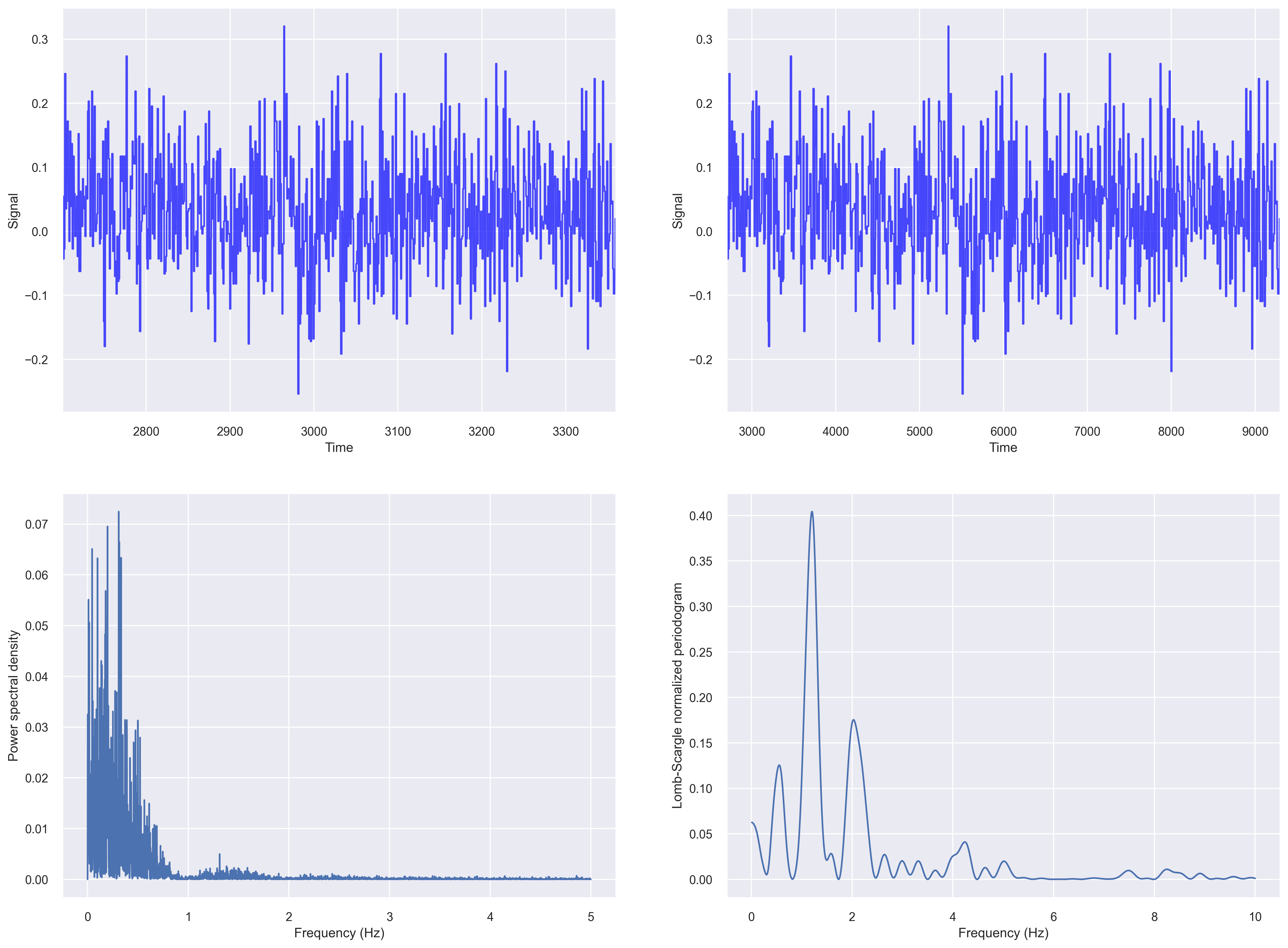
Periodogram of irregularly sampled data
Let us compute the fft based periodogram and Lomb-Scargle periodogram of our irregularly sampled data from the previous section.
fig, ax_list = plt.subplots(2,2, figsize=(20, 15), dpi=100)

# fig 1
ax=ax_list[0,0]
data = df['X1'].values
t_steps = df['time_sec'].values
ax.plot(t_steps, data, color='blue', alpha=0.7)
ax.set_ylabel("Signal")
ax.set_xlabel("Time")
ax.set_xlim((t_steps[0], t_steps[-1]))


# fig 2
ax=ax_list[0,1]
data = df['X1'].values
t_steps0 = df['time_sec'].values
t_steps = np.arange(t_steps0[0], t_steps0[0]+len(data))
ax.plot(t_steps, data, color='blue', alpha=0.7)
ax.set_ylabel("Signal")
ax.set_xlabel("Time")
ax.set_xlim((t_steps[0], t_steps[-1]))


# fig 3
ax=ax_list[1,0]
input_signal = df['X1'].values
t_steps = df['time_sec'].values

f, Pxx_den = signal.periodogram(input_signal, fs=10)
ax.plot(f, Pxx_den)
ax.set_ylabel('Power spectral density')
ax.set_xlabel('Frequency (Hz)')

# fig 4
# Plot Lomb-Scargle spectrogram of input signal
ax = ax_list[1,1]
data = df['X1'].values
t_steps = df['time_sec'].values
f = np.linspace(0.01, 10, 1000)
pgram = signal.lombscargle(x, y, f, normalize=True)
ax.plot(f, pgram)
ax.set_ylabel("Lomb-Scargle normalized periodogram")
ax.set_xlabel('Frequency (Hz)')
plt.savefig('periodogram_plot.png', dpi=300, bbox_inches='tight')
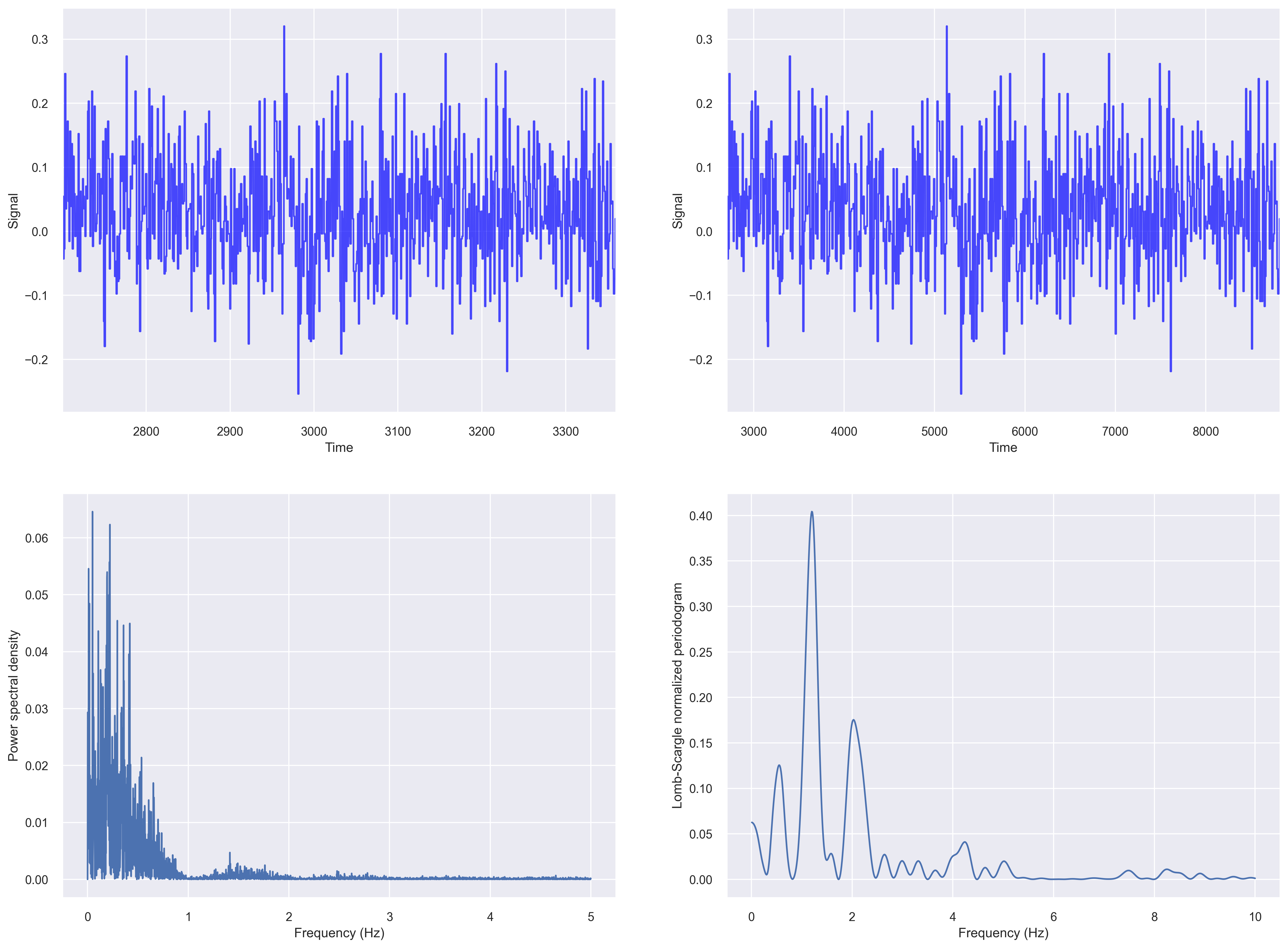
For plotting a Lomb–Scargle periodogram
Periodogram after resampling the data
Let us first resample time series to even intervals of 0.1s.
dfnew = df.resample("100l").last().interpolate(method="nearest")
fig, ax_list = plt.subplots(2,2, figsize=(20, 15), dpi=100)

# fig 1
ax=ax_list[0,0]
data = dfnew['X1'].values
t_steps = dfnew['time_sec'].values
ax.plot(t_steps, data, color='blue', alpha=0.7)
ax.set_ylabel("Signal")
ax.set_xlabel("Time")
ax.set_xlim((t_steps[0], t_steps[-1]))


# fig 2
ax=ax_list[0,1]
data = dfnew['X1'].values
t_steps0 = dfnew['time_sec'].values
t_steps = np.arange(t_steps0[0], t_steps0[0]+len(data))
ax.plot(t_steps, data, color='blue', alpha=0.7)
ax.set_ylabel("Signal")
ax.set_xlabel("Time")
ax.set_xlim((t_steps[0], t_steps[-1]))


# fig 3
ax=ax_list[1,0]
input_signal = dfnew['X1'].values
t_steps = dfnew['time_sec'].values

f, Pxx_den = signal.periodogram(input_signal, fs=10)
ax.plot(f, Pxx_den)
ax.set_ylabel('Power spectral density')
ax.set_xlabel('Frequency (Hz)')


# fig 4
# Plot Lomb-Scargle spectrogram of input signal
ax = ax_list[1,1]
data = dfnew['X1'].values
t_steps = dfnew['time_sec'].values
f = np.linspace(0.01, 10, 1000)
pgram = signal.lombscargle(x, y, f, normalize=True)
ax.plot(f, pgram)
ax.set_ylabel("Lomb-Scargle normalized periodogram")
ax.set_xlabel('Frequency (Hz)')
plt.savefig('periodogram_plot_evendata.png', dpi=300, bbox_inches='tight')
Conclusions
In this post, we saw a few aspects of analyzing time series data with uneven sampling. For more details, I refer readers to the references below, such as Understanding the Lomb–Scargle Periodogram, and others.
Further readings
- Deep Learning on Bad Time Series Data: Corrupt, Sparse, Irregular and Ugly
- Latent Ordinary Differential Equations for Irregularly-Sampled Time Series
- INTERPOLATION, REALIZATION, AND RECONSTRUCTION OF NOISY,IRREGULARLY SAMPLED DATA
- Interpolation of Irregularly Sampled Data Series-A Survey
- Understanding the Lomb–Scargle Periodogram
Disclaimer of liability
The information provided by the Earth Inversion is made available for educational purposes only.
Whilst we endeavor to keep the information up-to-date and correct. Earth Inversion makes no representations or warranties of any kind, express or implied about the completeness, accuracy, reliability, suitability or availability with respect to the website or the information, products, services or related graphics content on the website for any purpose.
UNDER NO CIRCUMSTANCE SHALL WE HAVE ANY LIABILITY TO YOU FOR ANY LOSS OR DAMAGE OF ANY KIND INCURRED AS A RESULT OF THE USE OF THE SITE OR RELIANCE ON ANY INFORMATION PROVIDED ON THE SITE. ANY RELIANCE YOU PLACED ON SUCH MATERIAL IS THEREFORE STRICTLY AT YOUR OWN RISK.
Leave a comment