Advanced 2D plots with Matplotlib in Python (codes included)
Key idea — a Figure holds Axes; you draw on the Axes. Matplotlib has two layers. A Figure is the whole canvas; it contains one or more Axes, and each Axes is a single plot with its own title, x/y labels, ticks, lines, and legend. The cleanest way to build a plot is object-first: fig, ax = plt.subplots(), then call methods on the ax object — ax.plot(...), ax.set_xlabel(...), ax.legend(). The plt.plot(...) / plt.xlabel(...) shortcuts you’ll also see here are just conveniences that act on the “current” Axes; every plot below is really one Figure with one or more Axes.
fig, ax = plt.subplots() — and call methods on ax.Simple 2D plots
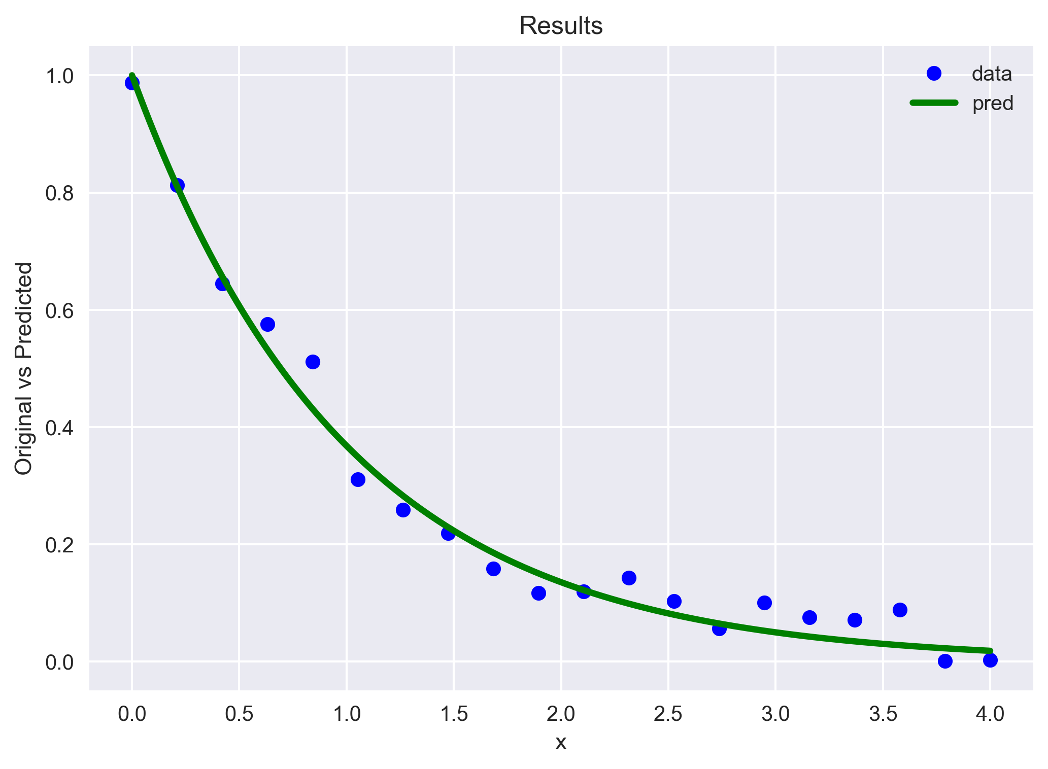
Let us make some fake data using the random module from the numpy library and then plot it using matplotlib.
import numpy as np
import matplotlib.pyplot as plt

plt.style.use('seaborn')

# make fake data
x_orig = np.linspace(0, 4, 20) # points between 0 and 4
noise = 0.025*np.random.normal(size=len(x_orig)) # random numbers
y_orig = np.exp(-x_orig) + noise # data is theory plus noise

# create theoretical curve to compare with "data"
x_pred = np.linspace(min(x_orig),max(x_orig), 200) # use more values to get smooth curve
y_pred = np.exp(-x_pred)

# setup the plots: both points and smooth curve
plt.plot(x_orig, y_orig, 'bo', label='data', lw=3) # points
plt.plot(x_pred, y_pred, color='green', label='pred', lw=3) # line
# plt.grid() #can use this if the style is not imported
plt.legend()
plt.xlabel('x')
plt.ylabel('Original vs Predicted')
plt.title("Results")

plt.savefig('simple_plot_non_log.png',dpi=300,bbox_inches='tight')
plt.close('all')
We used the style seaborn. Alternatively, many other styles can be used like classic, ggplot, etc. The noise is generated by taking samples from the gaussian distribution.
'seaborn' was renamed. The bare seaborn style names were deprecated in matplotlib 3.6 and removed in 3.8, so plt.style.use('seaborn') now raises an error. Use the versioned name plt.style.use('seaborn-v0_8') (or 'seaborn-v0_8-darkgrid', etc.), or call import seaborn as sns; sns.set_theme() if you have seaborn installed. Run print(plt.style.available) to list every style your matplotlib provides — classic and ggplot still work as written.
The np.linspace function generates the equally distributed 200 points between the min and max of x_orig. For saving the plot, the argument bbox_inches crop the white spaces in the figure and dpi set the print resolution of the image. Finally, we close the plot using plt.close('all'). This comes in handy when you use the for loop to save many figures iteratively.
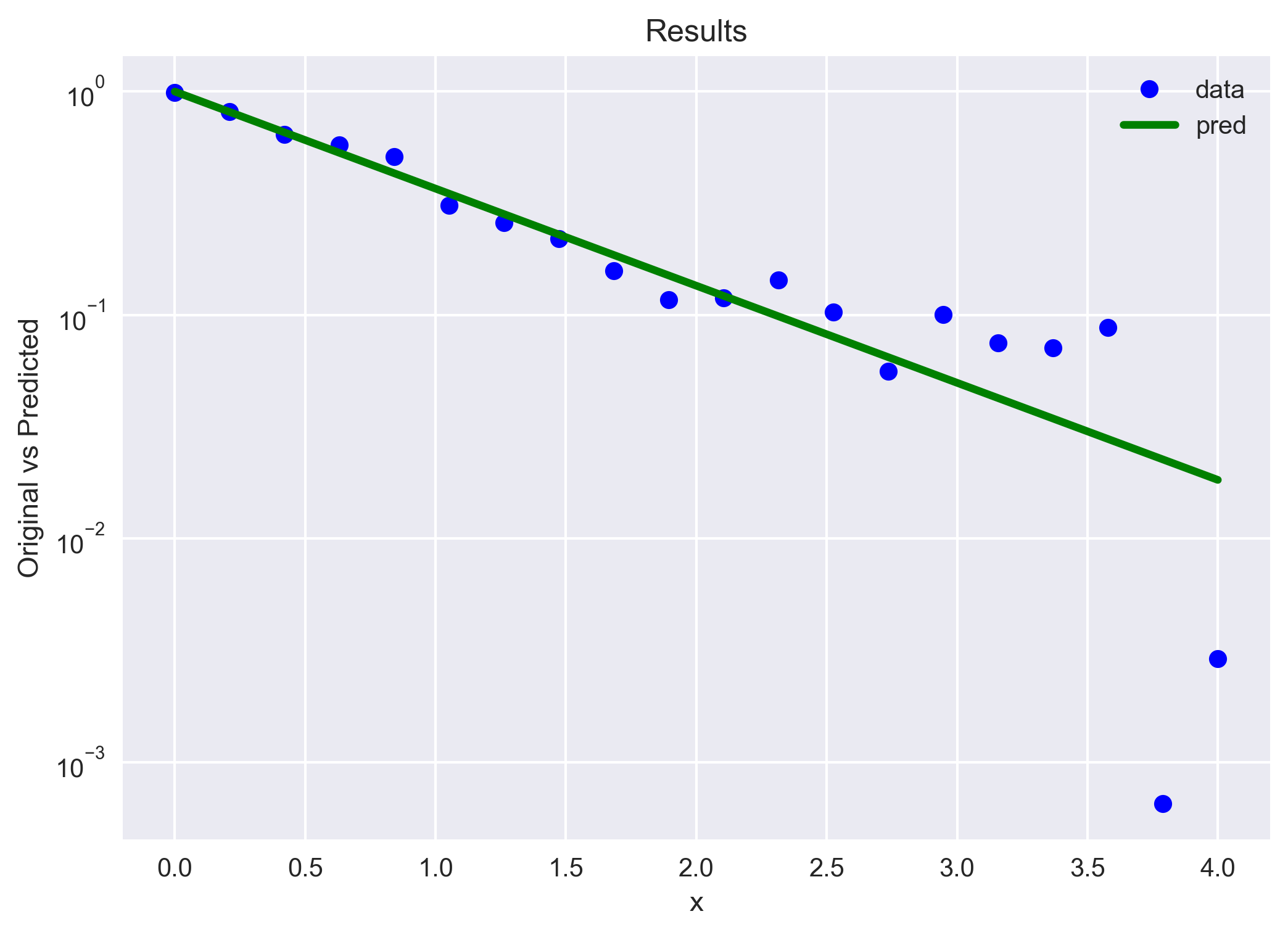
Now, we linearize this plot using the log of the y axis (plt.yscale)
# setup the plots: both points and smooth curve
fig= plt.figure()
plt.plot(x_orig, y_orig, 'bo', label='data', lw=3) # points
plt.plot(x_pred, y_pred, color='green', label='pred', lw=3) # line
# plt.grid() #can use this if the style is not imported
plt.legend()
plt.xlabel('x')
plt.ylabel('Original vs Predicted in log')
plt.title("Results")
plt.yscale('log') # make the y axis (ordinate) log; that is, log-linear

plt.savefig('simple_plot.png',dpi=300,bbox_inches='tight')
plt.close('all') # its a good practice to close all the figures
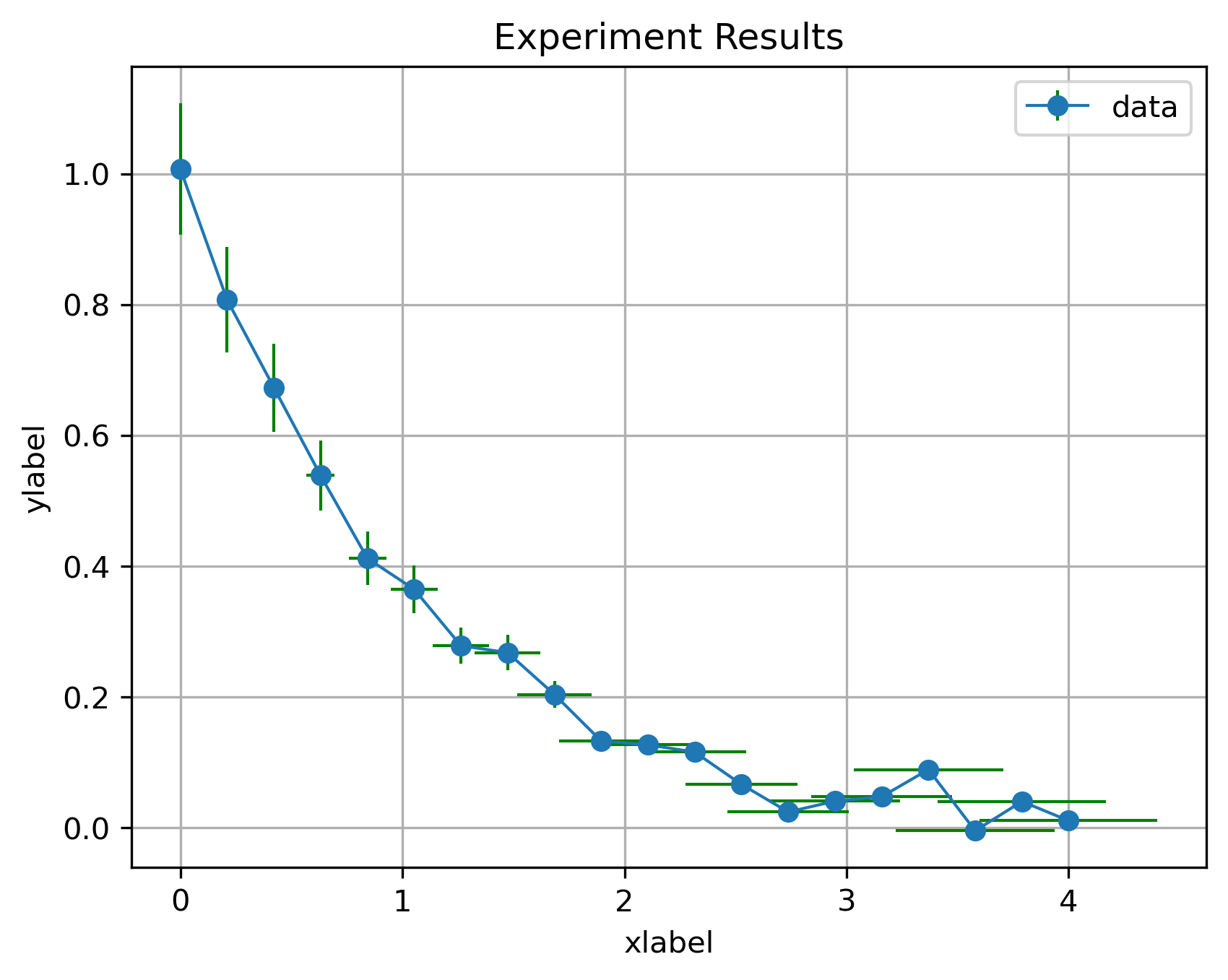
Error bars on the data
Sometimes we need to show the error bars on the measurements as a graphical representation of the variability of data or to indicate the error or uncertainty in a reported measurement.
The error bars give a general idea of how precise a measurement is, or conversely, how far from the reported value the true (error free) value might be.
import numpy as np
import matplotlib.pyplot as plt

# make fake data
x_orig = np.linspace(0, 4, 20) # points between 0 and 4
noise = 0.025*np.random.normal(size=len(x_orig)) # random numbers
y_orig = np.exp(-x_orig) + noise # data is theory plus noise


# including the error bar at each point (10% of the originals)
x_err = x_orig*0.1
y_err = y_orig*0.1

# add to plot the data as (x,y) with error bars
plt.errorbar(x_orig, y_orig, yerr = y_err, xerr = x_err, lw=1,
 ecolor='g', fmt='o-', capthick=2, label='data')

plt.title('Experiment Results')
plt.ylabel('ylabel')
plt.xlabel('xlabel')
plt.legend()
plt.grid()

plt.savefig('error_bars.png',dpi=300,bbox_inches='tight')
plt.close('all')
For this example, we arbitrarily took the error bars at each point to be 10% of the original value. We showed the errors in both x and y directions.
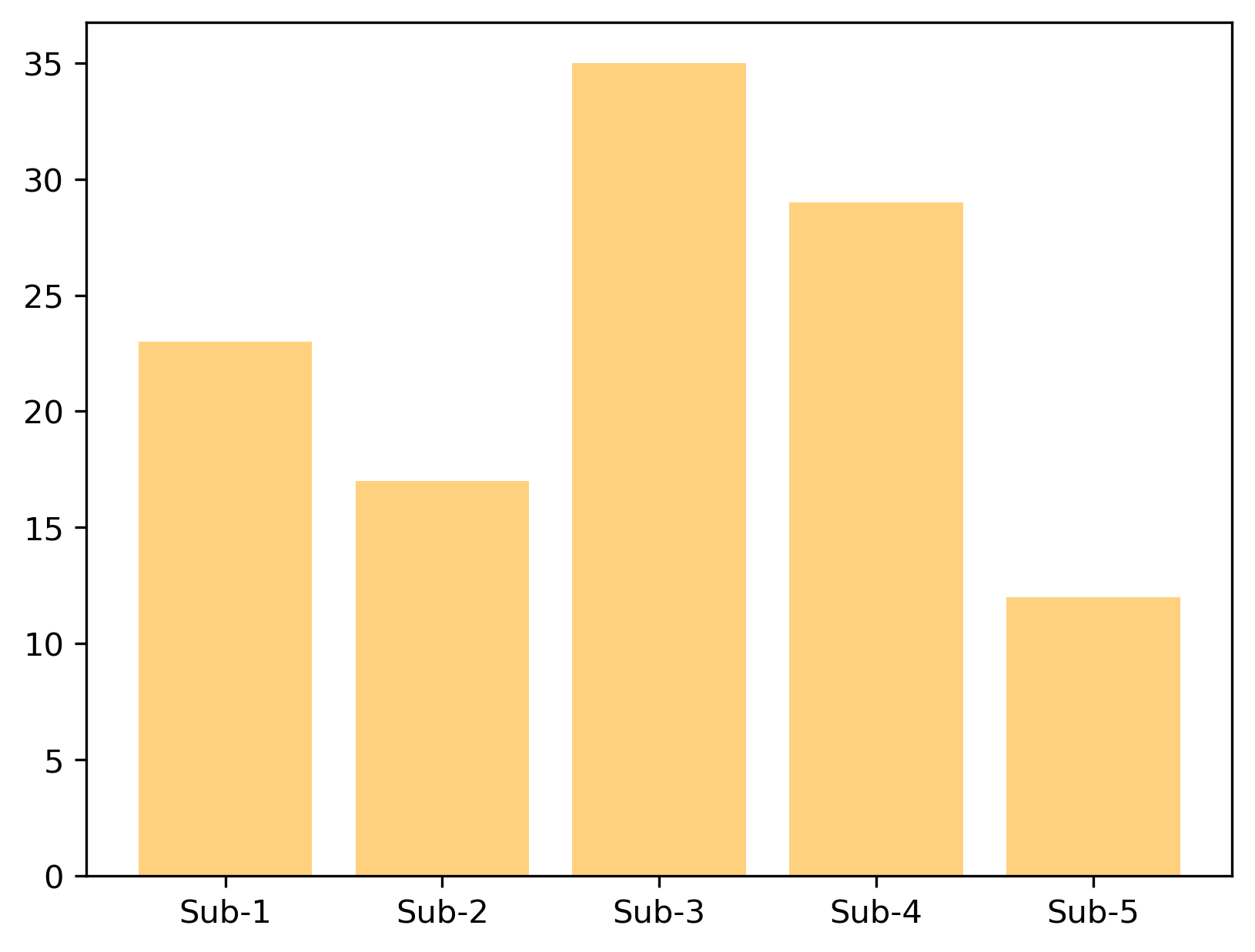
Bar plot
Bar charts are best suited for categorical data. It answers the question of “how many”.
It is important to keep in mind that when the number of categories in your dataset is huge then bar plot may not be the best way to visualize for your data.
Simple
import matplotlib.pyplot as plt
import numpy as np

## Parameters
opacity=0.5

fig, ax = plt.subplots()

langs = ['Sub-1', 'Sub-2', 'Sub-3', 'Sub-4', 'Sub-5']
students = [23,17,35,29,12]
ax.bar(langs,students, color='orange', alpha=opacity)

plt.savefig('bar_plots.png',dpi=300,bbox_inches='tight')
plt.close('all')
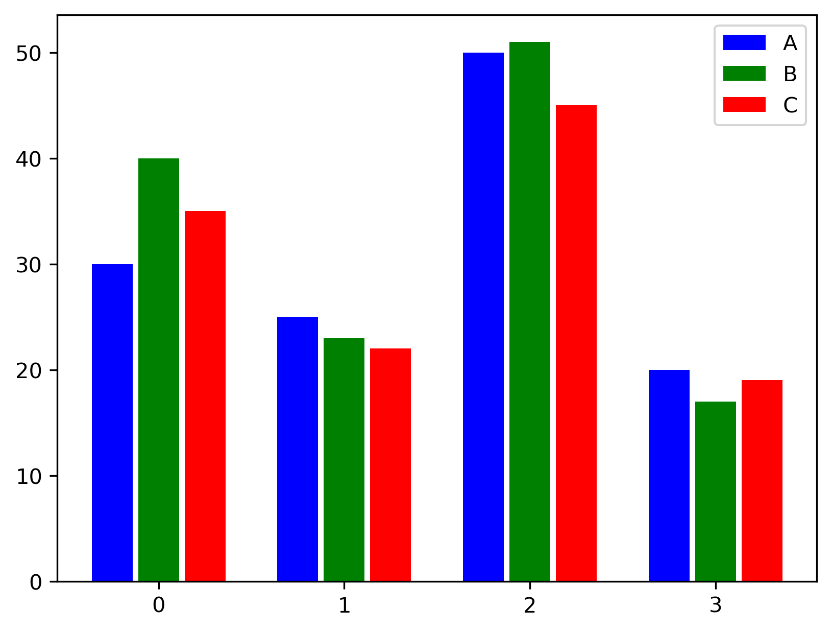
More than one bar
import matplotlib.pyplot as plt
import numpy as np

## Parameters
bar_width = 0.25
opacity=0.5

data = [[30, 25, 50, 20],
[40, 23, 51, 17],
[35, 22, 45, 19]]
X = np.arange(4)

fig, ax = plt.subplots()
ax.bar(X, data[0], color = 'b', width = 0.22, label='A')
ax.bar(X + bar_width, data[1], color = 'g', width = 0.22, label='B')
ax.bar(X + 2*bar_width, data[2], color = 'r', width = 0.22, label='C')
plt.legend()
plt.xticks(X + bar_width,X)
plt.savefig('bar_plots2.png',dpi=300,bbox_inches='tight')
plt.close('all')
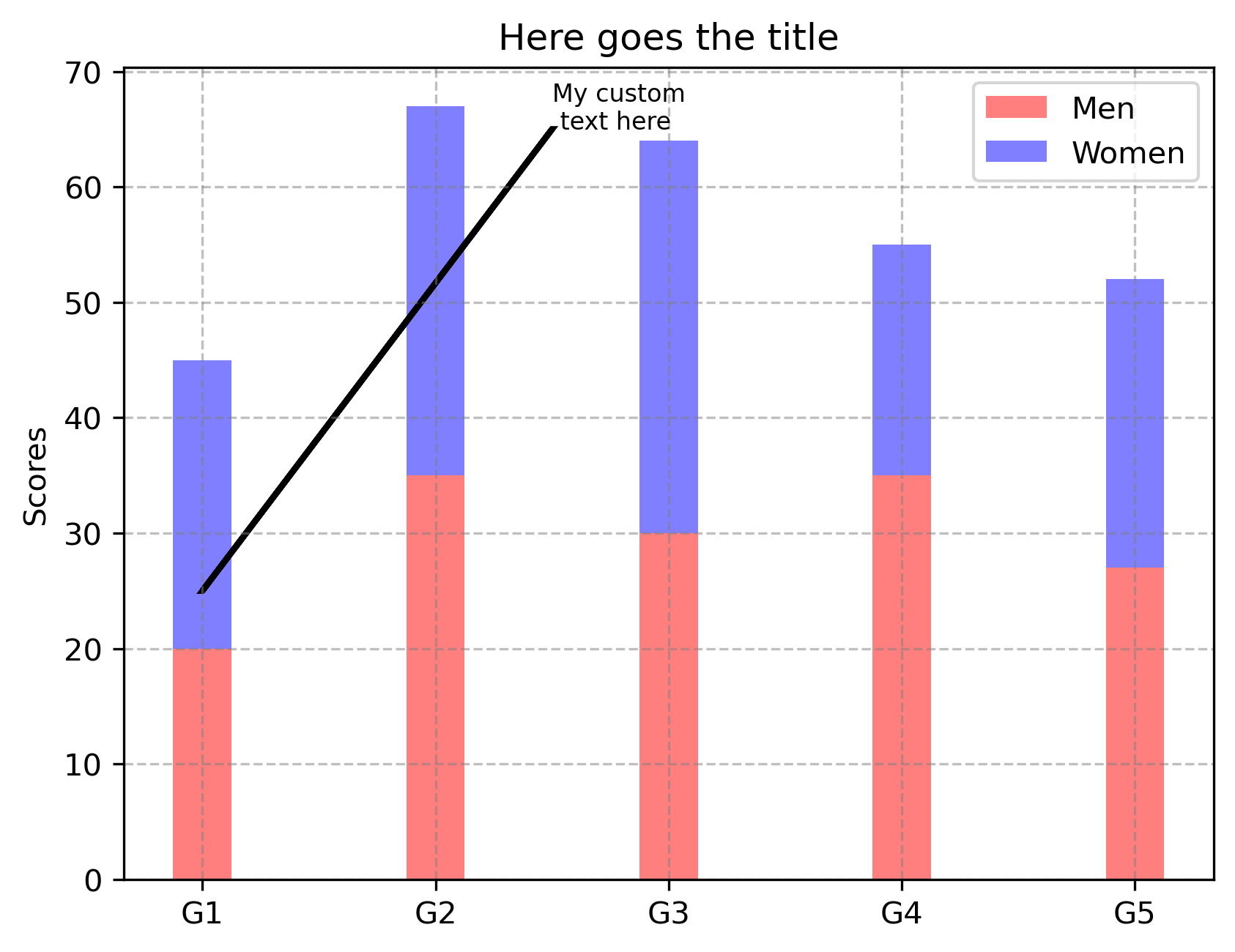
Stacked bars, annotations, and arrow
opacity=0.5
N = 5
menMeans = (20, 35, 30, 35, 27)
womenMeans = (25, 32, 34, 20, 25)
ind = np.arange(N) # the x locations for the groups
bar_width = 0.25


fig, ax = plt.subplots()
ax.bar(ind, menMeans, bar_width, color='r', alpha=opacity)
ax.bar(ind, womenMeans, bar_width, bottom=menMeans, color='b', alpha=opacity)
ax.set_ylabel('Scores')
ax.set_title('Here goes the title')
ax.set_yticks(np.arange(0, 81, 10))
ax.legend(labels=['Men', 'Women'])
ax.grid(color='gray', alpha=opacity, linestyle='dashed')

## Text and arrow on a plot
plt.text(1.5, 65, 'My custom\n text here', size=8)
plt.arrow(1.5, 65, -1.5, -40, shape='full', lw=2)

plt.xticks(ind,('G1', 'G2', 'G3', 'G4', 'G5'))

plt.savefig('stacked_bar.png',dpi=300,bbox_inches='tight')
plt.close('all')
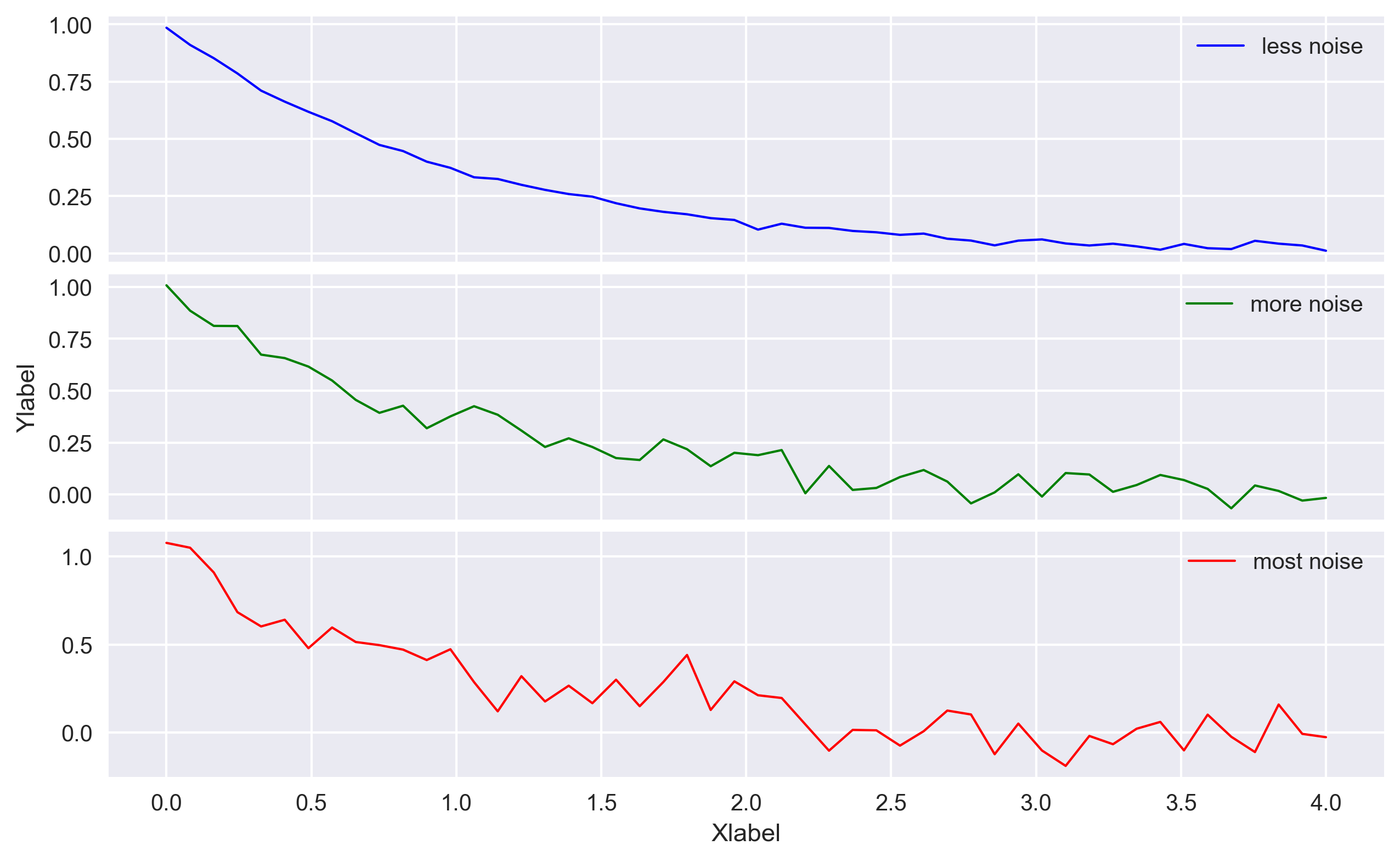
Multiple plots in a figure
import numpy as np
import matplotlib.pyplot as plt

plt.style.use('seaborn')

# make fake data
x_orig = np.linspace(0, 4, 50) # points between 0 and 4

y_orig = np.exp(-x_orig) + 0.01*np.random.normal(size=len(x_orig)) # data is theory plus noise
y_orig2 = np.exp(-x_orig) + 0.05*np.random.normal(size=len(x_orig))
y_orig3 = np.exp(-x_orig) + 0.1*np.random.normal(size=len(x_orig))


fig, (ax1, ax2, ax3) = plt.subplots(3,1,figsize=(10,6),sharex=True)
ax1.plot(x_orig, y_orig, 'b', label='less noise', lw=1) # points
ax1.legend()

ax2.plot(x_orig, y_orig2, 'g', label='more noise', lw=1) # points
ax2.legend()
ax2.set_ylabel("Ylabel")

ax3.plot(x_orig, y_orig3, 'r', label='most noise', lw=1) # points
ax3.legend()
ax3.set_xlabel('Xlabel')

plt.subplots_adjust(wspace=0, hspace=0.05)
plt.savefig('multiple_plots.png',dpi=300,bbox_inches='tight')
plt.close('all')
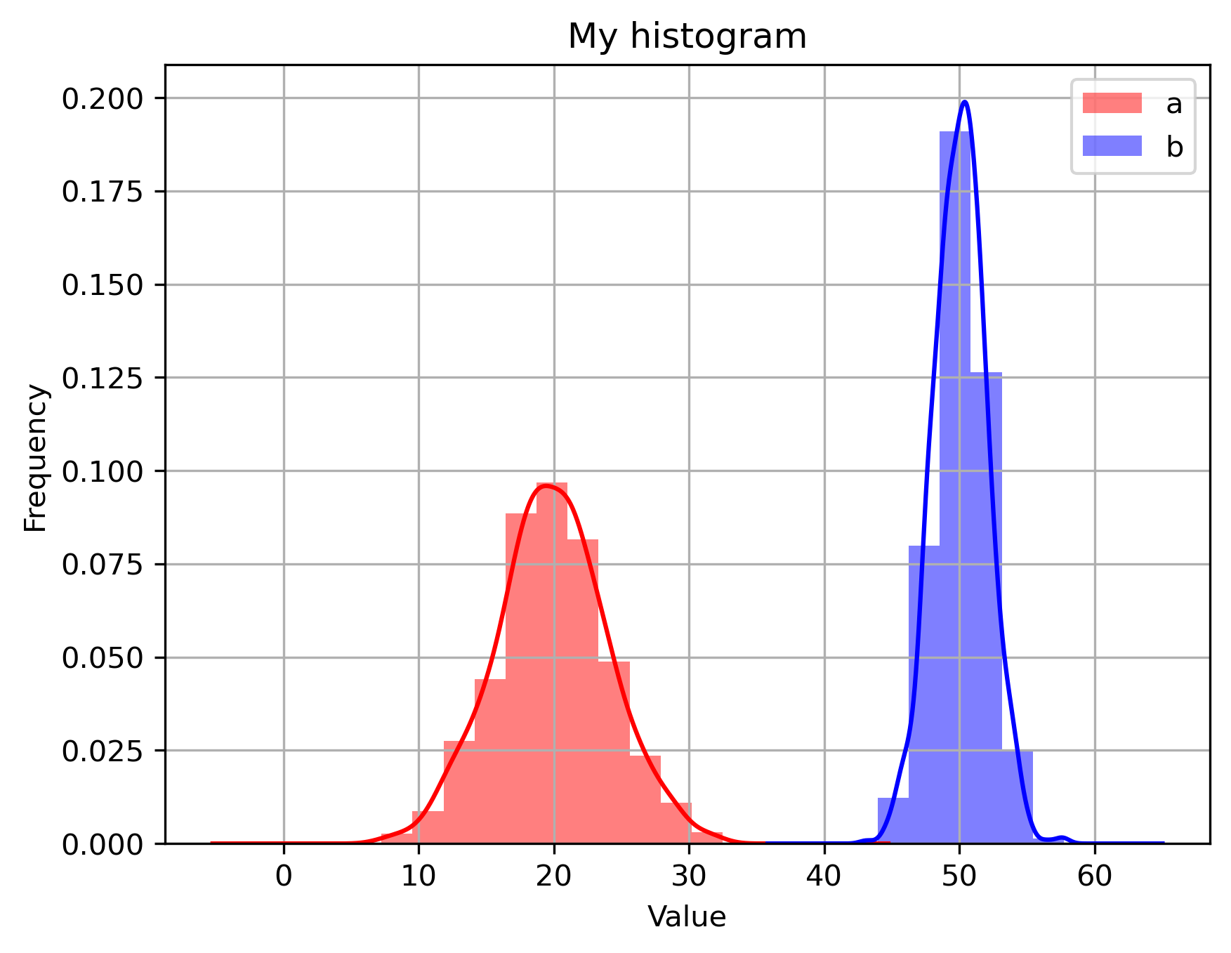
Plotting histograms
I like to plot histograms with the help of the pandas library as it provides a neat plot and offers several methods to manipulate and analyze the data. It is one of the most common way to visualize the distribution of continuous data over an interval (bin). Each bar in a histogram represents the tabulated frequency at each interval.
Histograms also give a rough view of the probability distribution of the data.
import numpy as np
import matplotlib.pyplot as plt
import pandas as pd

means = 20, 50
stdevs = 4, 2
dist = pd.DataFrame(np.random.normal(loc=means, scale=stdevs, size=(1000, 2)),columns=['a', 'b'])

opacity = 0.5
bin_width = 0.8

fig, ax = plt.subplots()
# n, bins, patches = ax.hist(x=dist['a'], bins='auto', color='#0504aa',alpha=opacity, rwidth=bin_width)

dist.plot.kde(ax=ax, legend=False, title='My histogram', color=['r','b'])
dist.plot.hist(density=True,bins=22, alpha=opacity, ax=ax, backend='matplotlib', grid=True, color=['r','b'])
plt.xlabel('Value')
plt.ylabel('Frequency')

plt.savefig('histograms.png',dpi=300,bbox_inches='tight')
plt.close('all')
Download Codes
Download all the codes from my github repo
Quick check: You wrote fig, ax = plt.subplots(). How do you give this plot an x-axis label?
plt.subplots.xlabel("x")ax.set_xlabel("x")fig.xlabel("x")plt.axes("x")
Recap
- A Figure is the canvas; each Axes is one plot on it.
fig, ax = plt.subplots()(orplt.subplots(3, 1)) creates them. - Prefer the object API —
ax.plot(...),ax.bar(...),ax.set_xlabel(...),ax.legend()— over theplt.*state shortcuts; it’s clearer once you have more than one Axes. - Pick the chart to the data: line/scatter for trends,
errorbarfor uncertainty, bar for categories, histogram/KDE for distributions, andsubplots(sharex=True)to stack related series. - Handy finishing touches:
plt.yscale('log')to linearize exponential data,bbox_inches='tight'+dpiwhen saving, andplt.close('all')inside loops that write many figures. - Style with
plt.style.use('seaborn-v0_8')(the renamed seaborn style) or any name fromplt.style.available.
Where to go next
- Introduction to scientific computing with NumPy — generate and shape the arrays you plot.
- How to start using pandas for Earth data analysis — the DataFrame
.plotAPI used in the histogram section. - Introduction to Python for beginners — the install-and-first-plot starting point.
References
Disclaimer of liability
The information provided by the Earth Inversion is made available for educational purposes only.
Whilst we endeavor to keep the information up-to-date and correct. Earth Inversion makes no representations or warranties of any kind, express or implied about the completeness, accuracy, reliability, suitability or availability with respect to the website or the information, products, services or related graphics content on the website for any purpose.
UNDER NO CIRCUMSTANCE SHALL WE HAVE ANY LIABILITY TO YOU FOR ANY LOSS OR DAMAGE OF ANY KIND INCURRED AS A RESULT OF THE USE OF THE SITE OR RELIANCE ON ANY INFORMATION PROVIDED ON THE SITE. ANY RELIANCE YOU PLACED ON SUCH MATERIAL IS THEREFORE STRICTLY AT YOUR OWN RISK.
Leave a comment