How to avoid common mistakes in analyzing correlations of two time-series
Most often, data analysts consider the correlation between two time-series as a causation effect. Two time-series are correlated that does not imply that one causes the other.
Import libraries in python
import pandas as pd
import numpy as np
import matplotlib.pyplot as plt
import matplotlib
import seaborn as sns
matplotlib.rcParams['figure.figsize'] = (20, 4)
from matplotlib import style
from scipy import stats
style.use('ggplot')
%matplotlib inline
Pearson cross-correlation function
We define the Pearson cross-correlation function below. But the correlation value can also be obtained by using the scipy.stats function “pearsonr”.
def average(x):
    assert len(x) > 0
    return float(sum(x)) / len(x)
def pearson_corr(x, y):
    assert len(x) == len(y)
    n = len(x)
    assert n > 0
    avg_x = average(x)
    avg_y = average(y)
    diffprod = 0
    xdiff2 = 0
    ydiff2 = 0
    for idx in range(n):
        xdiff = x[idx] - avg_x
        ydiff = y[idx] - avg_y
        diffprod += xdiff * ydiff
        xdiff2 += xdiff * xdiff
        ydiff2 += ydiff * ydiff
    return diffprod / np.sqrt(xdiff2 * ydiff2)
Uncertainty caused by the limited length of the time-series
Let us understand the correlation concept by manipulating two random time-series. We construct two time-series by taking a sample of 100 from the random normal distribution.
y1 = np.random.randn(100)
y2 = np.random.randn(100)
print('The correlation between the two time-series is: {}'.format(pearson_corr(y1, y2)))
The correlation between the two time-series is: 0.14213966200145894
Let us simulate this experiment 10000 times and plot the results as a histogram, where the x-axis shows the possible values of correlations. We do this for three lengths of time-series - 10, 100, and 1000.
samplesize=[10,100,1000]
results10=[]
results100=[]
results1000=[]
for num in range(10000):
    results10.append(pearson_corr(np.random.randn(samplesize[0]), np.random.randn(samplesize[0])))
    results100.append(pearson_corr(np.random.randn(samplesize[1]), np.random.randn(samplesize[1])))
    results1000.append(pearson_corr(np.random.randn(samplesize[2]), np.random.randn(samplesize[2])))

fig,ax=plt.subplots(1,3,figsize=(20,4))
ax[0].set_title('Sample size=10')
ax[0].set_xlabel('Correlation Vals')
ax[0].set_xlim([-1,1])
sns.distplot(results10, hist=True, kde=True, bins='auto', color = 'darkblue', hist_kws={'edgecolor':'black'},kde_kws={'linewidth': 2, "label": "KDE"},ax=ax[0])

ax[1].set_title('Sample size=100')
ax[1].set_xlabel('Correlation Vals')
ax[1].set_xlim([-1,1])
sns.distplot(results100, hist=True, kde=True, bins='auto', color = 'darkblue', hist_kws={'edgecolor':'black'},kde_kws={'linewidth': 2, "label": "KDE"},ax=ax[1])


ax[2].set_title('Sample size=1000')
ax[2].set_xlabel('Correlation Vals')
ax[2].set_xlim([-1,1])
sns.distplot(results1000, hist=True, kde=True, bins='auto', color = 'darkblue', hist_kws={'edgecolor':'black'},kde_kws={'linewidth': 2, "label": "KDE"},ax=ax[2])
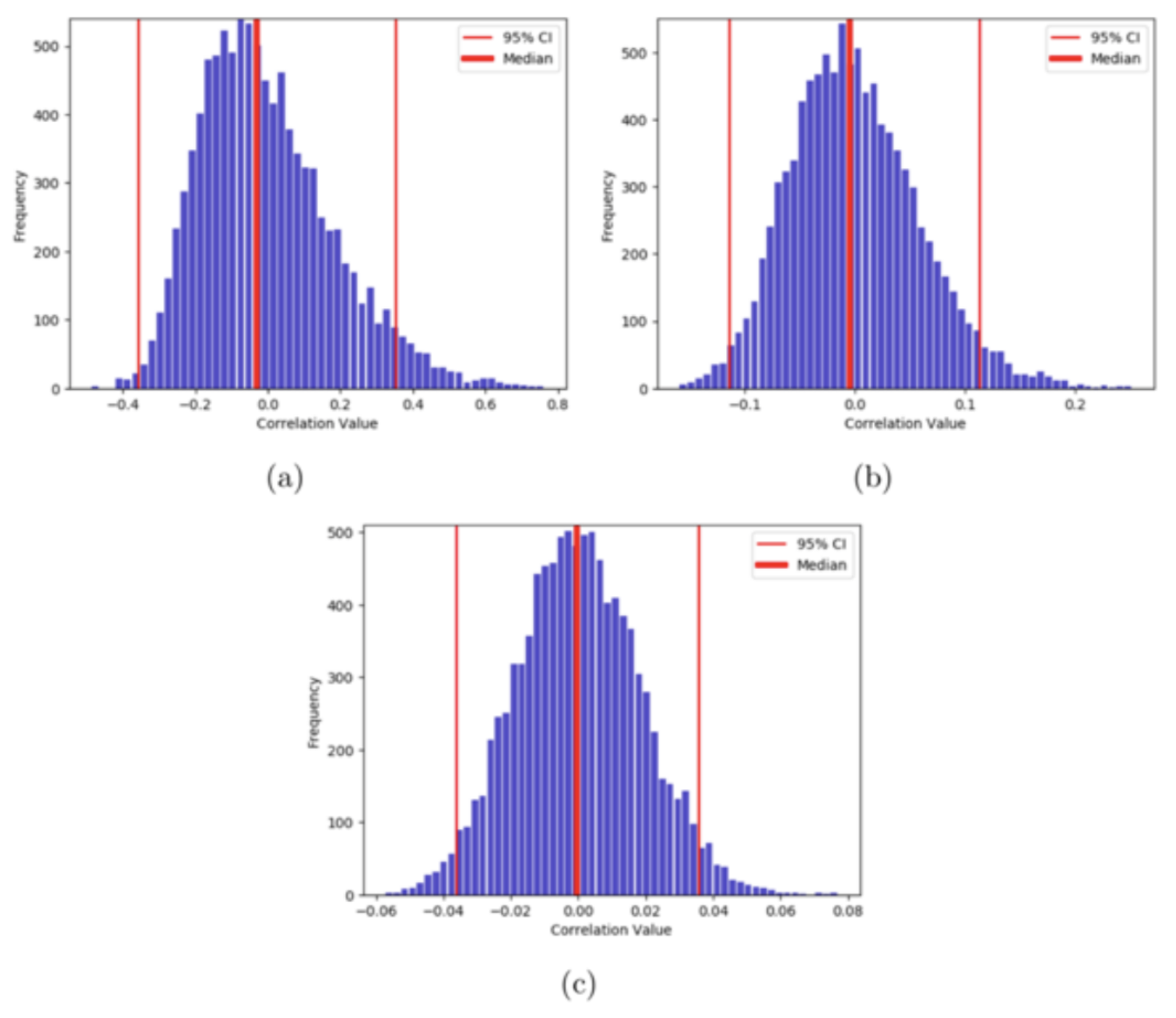
Here, we can notice that the variance or the spread of the correlation values decreases with the increase in the length. For the length of time-series 10, there is a higher probability of obtaining a correlation value of 0.8 than with the length of 1000. As our simulated time-series is random in nature, there should be almost no correlation between the two. So, we can say that the uncertainty in the measurement of correlation value decreases with the increase in the length of time-series. In other words, higher degrees of freedom ensures more certainty in the measurement.
Artifact due to inherent trend
The presence of the trend in the two time-series can lead to a spurious correlation result.
# Defining two time-series of length 1000
y1 = np.random.randn(1000)
y2 = np.random.randn(1000)
r,p_val=stats.pearsonr(y1, y2)
print('The correlation between the two time-series is: {} and the p_value: {}'.format(r,p_val))
The correlation between the two time-series is: -0.0014369994052275713 and the p_value: 0.963800357613402
Least square estimate of the two time-series
x=np.arange(1000)
slope1, intercept1 = stats.linregress(x,y1)[0:2]
print('slope={}, intercept={}'.format(slope1,intercept1))
line1 = slope1*x+intercept1

slope2, intercept2 = stats.linregress(x,y2)[0:2]
print('slope={}, intercept={}'.format(slope2,intercept2))
line2 = slope2*x+intercept2
slope=6.417571406961208e-05, intercept=-0.021270198713392002
slope=-4.366870437067292e-05, intercept=0.0027256214920765576
fig,ax=plt.subplots(2,1,sharex=True,figsize=(20,4))
ax[0].plot(x,y1)
ax[0].plot(x,line1)

ax[1].plot(x,y2)
ax[1].plot(x,line2)
We also computed the p-value of the correlation between the two randomly generated time-series and the value of ~0.3. The p-value is defined as the fraction of the more extreme distribution than the observed correlation value. So, a p-value of 0.3 simply means that the correlation value we obtained is not surprising.
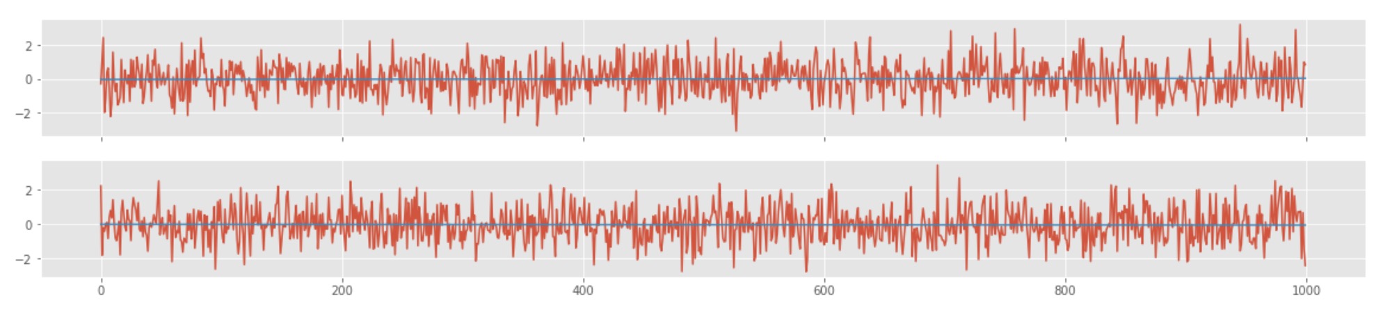
Now, let us add some trend to the two time-series data
y1prime = np.array([0.01*i+np.random.randn(1)[0] for i in range(1000)])
y2prime = np.array([0.01*i+np.random.randn(1)[0] for i in range(1000)])
x=np.arange(1000)
slope1p, intercept1p = stats.linregress(x,y1prime)[0:2]
print('slope={}, intercept={}'.format(slope1p,intercept1p))
line1p = slope1p*x+intercept1p

slope2p, intercept2p = stats.linregress(x,y2prime)[0:2]
print('slope={}, intercept={}'.format(slope2p,intercept2p))
line2p = slope2p*x+intercept2p

rp,p_valp=stats.pearsonr(y1prime, y2prime)
print('The correlation between the two prime time-series is: {} and the p_value: {}'.format(rp,p_valp))
slope=0.009994356492628568, intercept=0.01767420018768373
slope=0.010056002246056309, intercept=0.0007807001268052005
The correlation between the two prime time-series is: 0.8954320848839542 and the p_value: 0.0
fig,ax=plt.subplots(2,1,sharex=True,figsize=(20,4))
ax[0].plot(x,y1prime)
ax[0].plot(x,line1p)

ax[1].plot(x,y2prime)
ax[1].plot(x,line2p)

Here, we can see that the correlation between the two time-series is ~.9, and the p-value is ~0. This shows that the two time-series are highly correlated, but one time-series is not causing the other. The time-series shows a strong but spurious relationship. Here, the first time-series is dependent on time, and the other one is dependent on time as well. The correlation is just a result of the fact that both of them are dependent on time. This sort of trend in both the time-series is popularly known as a secular trend. The correlation value also depends highly on the amount of trend present in the data.
Dealing with artifact due to trend
To remove the artifact due to trend, it’s best to remove the trend from the data before cross-correlating. There are a few ways of dealing with it:
- Model the trend in each time-series and use that model to remove the trend. If we find the linear regression line as the trend, then subtract that line from data points.
- There is a non-parametric way of dealing with the trend too. We can remove the first differences. We subtract from each data point the point that came before. Instead of first differences, one can also undergo the approach of link relatives. In this approach, we divide each point by the point that came before it.
Here, let us remove the linear regression model we have calculated from the data.
y1prime_new = y1prime - line1p
y2prime_new = y2prime - line2p

rp_new,p_valp_new=stats.pearsonr(y1prime_new, y2prime_new)
print('The correlation between the two prime time-series is: {} and the p_value: {}'.format(rp_new,p_valp_new))
The correlation between the two prime time-series is: -0.023904465533724377 and the p_value: 0.4501961718707913
We have successfully removed the trend from our data, and the correlation dropped back to ~0, and p-value also increased.
Is detrending is enough to deal with any sort of spurious correlation results?
No, even after detrending, two time-series can be falsely correlated. There may still be patterns such as seasonality, periodicity, and autocorrelation. It is best to deal with those before checking for the possible correlation.
Disclaimer of liability
The information provided by the Earth Inversion is made available for educational purposes only.
Whilst we endeavor to keep the information up-to-date and correct. Earth Inversion makes no representations or warranties of any kind, express or implied about the completeness, accuracy, reliability, suitability or availability with respect to the website or the information, products, services or related graphics content on the website for any purpose.
UNDER NO CIRCUMSTANCE SHALL WE HAVE ANY LIABILITY TO YOU FOR ANY LOSS OR DAMAGE OF ANY KIND INCURRED AS A RESULT OF THE USE OF THE SITE OR RELIANCE ON ANY INFORMATION PROVIDED ON THE SITE. ANY RELIANCE YOU PLACED ON SUCH MATERIAL IS THEREFORE STRICTLY AT YOUR OWN RISK.
Leave a comment