Computing cross-correlation and spectrogram of two seismic traces (codes included)
I want to compute the relation between two seismic traces using the cross-correlation. First I compute the spectrogram of each trace using the spectrogram method in Obspy. Then, I cross-correlate the two seismic traces and plot its time-domain cross-correlation function and spectrogram.
Key idea — cross-correlation slides one signal past the other to find how they line up. At every lag $\tau$ you shift signal B, multiply it point-by-point with A, and sum. Do that for a range of lags and you get a correlation curve: its peak location is the time delay between the two traces (how much later one arrives), and its peak height is how similar they are. Pairing that with a spectrogram lets you see both when the signals align and which frequencies they share.
For details on how to compute cross-correlation, visit my previous post:
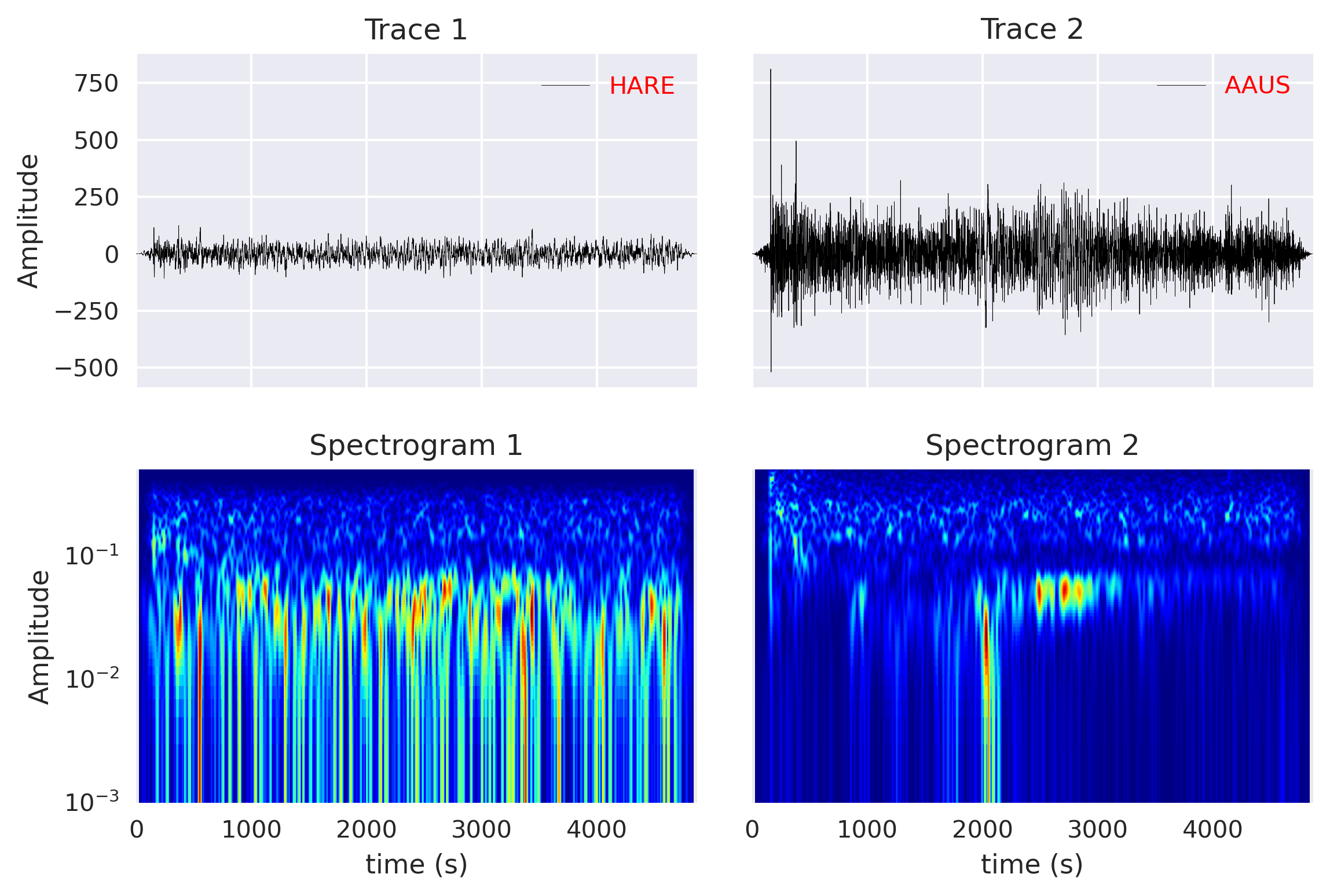
Compute and plot spectrogram of each traces
I have a mseed file all_stream_HLZ_20071215_080316.mseed that contains multiple traces. I used the first two traces for this study.
For plotting the time series, I first read the data using the read function from Obspy and then plot the “data” and “times” methods avilable for the Trace object.
from obspy import read
from obspy import read, Trace, UTCDateTime
import numpy as np
import pandas as pd
import noise
import matplotlib.pyplot as plt
plt.rcParams['figure.figsize'] = [10,6]
plt.rcParams.update({'font.size': 18})
plt.style.use('seaborn')

filenameZ = 'all_stream_HLZ_20071215_080316.mseed'
fignameTrace = 'spectrogram_layout1.png'
figxcorr = 'spectrogram_layout2.png'
figxcorr2 = 'spectrogram_layout3.png'
st = read(filenameZ)
tr1 = st[0]
tr2 = st[1]

sta1 = tr1.stats['station']

fig, axx = plt.subplots(2,2, sharex=True, sharey='row')
axx[0, 0].plot(tr1.times(), tr1.data, 'k-', linewidth=0.2, label=tr1.stats['station'])
axx[0, 1].plot(tr2.times(), tr2.data, 'k-', linewidth=0.2, label=tr2.stats['station'])
axx[0, 0].set_title(f'Trace 1')
axx[0, 1].set_title(f'Trace 2')
axx[0, 0].set_ylabel('Amplitude')

tr1.spectrogram(log=True, wlen=50,show=False, axes=axx[1, 0], cmap='jet', samp_rate=tr1.stats.sampling_rate)
tr2.spectrogram(log=True, wlen=50,show=False, axes=axx[1, 1], cmap='jet', samp_rate=tr2.stats.sampling_rate)
axx[1, 0].set_title('Spectrogram 1')
axx[1, 1].set_title('Spectrogram 2')
axx[1, 0].set_xlabel('time (s)')
axx[1, 1].set_xlabel('time (s)')
axx[1, 0].set_ylabel('Amplitude')
plt.tight_layout()

## put legend
for col in axx[0,:]:
    ll = col.legend(loc=1)
    plt.setp(ll.get_texts(), color='red') #color legend

plt.savefig(fignameTrace, bbox_inches='tight', dpi=300)
plt.close('all')
Matplotlib note: plt.style.use('seaborn') was removed in Matplotlib 3.8 — use plt.style.use('seaborn-v0_8') on a current install. The ObsPy read and Trace.spectrogram calls used here are still current; wlen sets the FFT window length and trades time resolution against frequency resolution.
Compute the cross correlation using the Pandas library
For computing the cross-correlation, I use the crosscorr function. Readers can refer to this function in this post. The steps for computing the cross-correlation is also very similar as the previous post.
However, I obtained the spectrogram using the spectrogram method of Obspy. This method is well optimized for seismic data. There are several other spectrogram functions available in Python and most of them work in the same way. The obtained spectrogram for this post is using window length for fft of 50 seconds (wlen), and output the frequencies in logarithmic scale.
### Cross Correlation using Pandas
series1, series2 = pd.Series(tr1.data),  pd.Series(tr2.data)
window = 1
maxlag = 500
lags = np.arange(-(maxlag), (maxlag), window)  # contrained
rs = np.nan_to_num([crosscorr(series1, series2, lag) for lag in lags])

traceCCF2 = Trace()
traceCCF2.data = rs
traceCCF2.times(reftime=tr1.stats.starttime)

fig, axx = plt.subplots(2,1)
axx[0].plot(lags, rs, 'k', linewidth=0.5)
axx[0].set_title('Cross Correlation')

traceCCF2.spectrogram(log=True, wlen=50,show=False, axes=axx[1], cmap='jet')
axx[1].set_title('Spectrogram')
plt.tight_layout()
plt.savefig(figxcorr2, bbox_inches='tight', dpi=300)
plt.close('all')
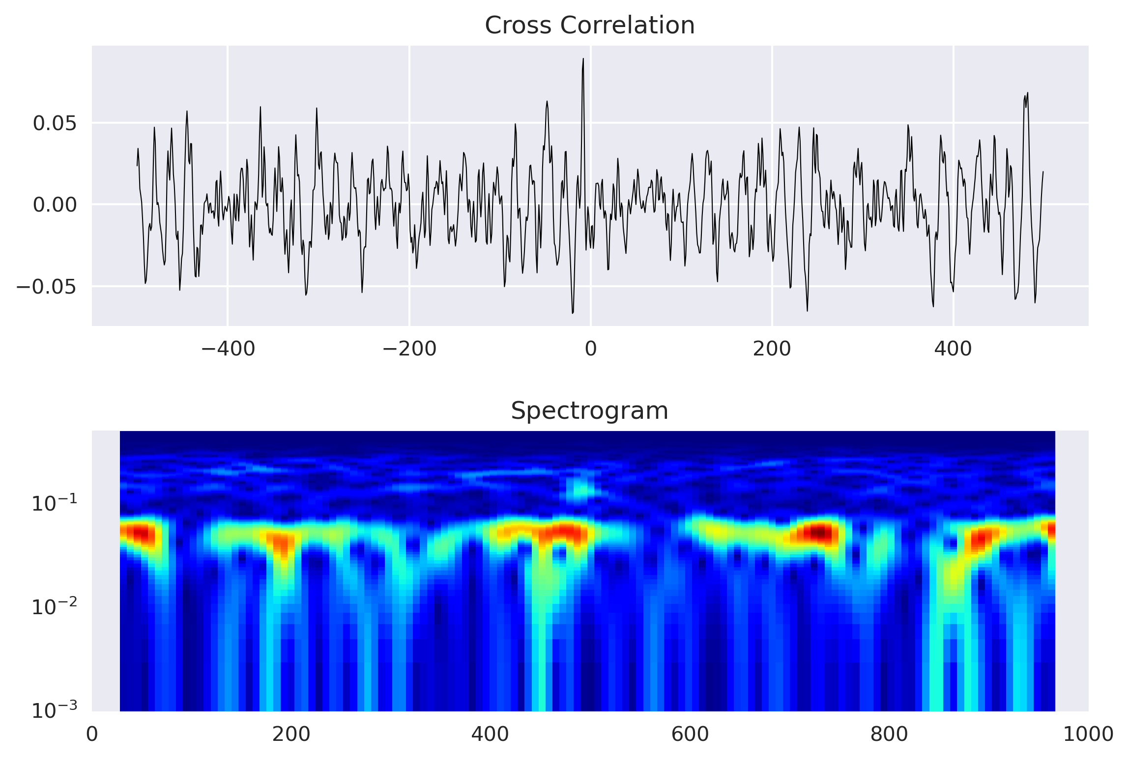
Quick check: In the cross-correlation function rs computed over lags, what does the position of the largest value tell you?
Recap
- Cross-correlation = slide, multiply, sum. Evaluate it over a range of lags; the peak’s lag is the delay and its height is the similarity between the two traces.
- Spectrogram adds the frequency view.
Trace.spectrogram(wlen=...)shows which frequencies are present over time;wlensets the time–frequency trade-off. - Reuse a helper. The
crosscorrfunction comes from the earlier cross-correlation post; here it’s mapped overlagsand wrapped in aTraceso it can be spectrogram-plotted too. - Mind the library versions. Use
seaborn-v0_8on Matplotlib ≥ 3.8; the ObsPy calls are unchanged.
Where to go next
- The cross-correlation helper in detail: Computing cross-correlation between seismograms
- What a spectrogram is (time–frequency basics): Towards multi-resolution analysis with the wavelet transform
- Concatenating traces before analysis: Concatenating daily seismic traces and plotting a spectrogram
Disclaimer of liability
The information provided by the Earth Inversion is made available for educational purposes only.
Whilst we endeavor to keep the information up-to-date and correct. Earth Inversion makes no representations or warranties of any kind, express or implied about the completeness, accuracy, reliability, suitability or availability with respect to the website or the information, products, services or related graphics content on the website for any purpose.
UNDER NO CIRCUMSTANCE SHALL WE HAVE ANY LIABILITY TO YOU FOR ANY LOSS OR DAMAGE OF ANY KIND INCURRED AS A RESULT OF THE USE OF THE SITE OR RELIANCE ON ANY INFORMATION PROVIDED ON THE SITE. ANY RELIANCE YOU PLACED ON SUCH MATERIAL IS THEREFORE STRICTLY AT YOUR OWN RISK.
Leave a comment